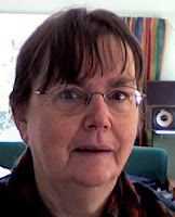
I have books! Boxes of actual, physical copies of my book. Zenith publishers have been great to work with and met every deadline we agreed to. See how they work at publishme.co.nz You can buy a copy for $28 plus freight from the same website – click on new releases or search on the book title or my name.
The cover looks fantastic, with colours richer than those in the image on this blog.
Now I am in marketing mode, not my favourite activity. However, needs must. The Women’s Bookshop in Auckland and Unity Books in Wellington will carry copies. I’ll work on expanding further into the independent bookstore network. My focus at the moment is libraries and my own networks, which are extensive, I can hook into several email lists and will be in the next newsletter from The Women’s Bookshop, which goes to 4000 subscribers.
I’m having a launch next Sunday at 4.30 here in Paekakariki at the local community hall. Writer Renee will launch Take It Easy. To help cover launch costs I will sell, for $10 a copy, some of my previously published books.
March 21, 2008


February 16, 2008
the cover & Launch

Here is the front cover.The artist, Seraphine Pick, was very gracious about me using her painting as the image. The blurb on the back, which was sooooo hard to write, reads:
Isobel is confronted by a decision from her past that she thought she had dealt with. Now she wants to understand her actions and that means digging back into her past. Surely she was fighting for her own sense of who she was, not just reacting to an arid childhood. A wobble in the foundations of her relationship with her partner Iris intensifies as Isobel seeks understanding of herself and of the meaning of family.
I tried very hard to make it cliche-free.
A date has been set for the launch - 30 March, here in Paekakariki. Renee, friend, writer, playwrite and poet will launch it and many of my Paekakariki friends will be involved. My partner Prue will MC the event.
We have a time line that is designed to get books in hand by Easter, which gives a week, more or less, with public holidays involved, before the launch date.
February 9, 2008
Production progress

This is the logo Jill and I have worked out for pjpress. Inside the box the black and white can be reversed. I'll put the cover on the next post, when I have a version with the new blurb text. Setting up a page on google pages, a kind of faux website as far as I can tell is my next step. Learning these new techniques is what I find hard, probably because I don't really understand what I am doing, I am just following instructions that don't necessarily mean a lot to me and my brain works best when it understands what's happening.
Very soon I will have a proof-reading printout, which my partner and a friend will proof-read for me - have done a copy edit - and then it will be ready to go to the printer who will provide a printed proof copy, which will be the moment of truth for how it actually looks as a book. I am planning a launch for 30 March, here in Paekakariki where I live, more in a later post on that.
January 19, 2008
layout, fonts and more
Holidays are over, layout is underway, cover designs are going back and forth between m e and Jill, who is doing the design work. There's a logo for PJ Press, too.
For me, because the details of designing and laying out a book are the least known aspects of this project, having Jill involved is essential. She knows the technical business of what used to be called typesetting and now is computerised. Selecting a font went differently from how I expected. I had a couple I liked, maybe a bit old-fashioned, but had the right feel - Garamond and Bookman. When I saw them in a page sized as for the book I wasn't so keen. Jill came up with Bembo and bingo! there it was. In fact, what we are heading towards is using that one font, in different sizes, for everything, including the cover, which Jill tells me is unusual. But so far I like it. The text will be in Bembo 10pt, with spacing between the lines as Jill has worked it out for readability, 5mm para indents.
We have gone for a simple page layout, page numbers centred at the bottom, no headers, chapters numbered but not named, each one starting on a new page. The book has three parts, each part starting with a quote so each of these will have a full page. There is a lot of detail to decide on. It matters, I think, and the end result should be that the reader doesn't especially notice any of it.
The cover is looking great. Pink (a kind of a melony pink from the artist's image) and grey sound bad but are looking good. The hardest part is the words for the back cover. As soon as I start writing something the cliches flow in a great torrent. One of the main plot points is not one I want to reveal on the cover, it's an unusual, possibly shocking, decision the protagonist made in her early life and to talk of a 'secret' in the blurb straightaway suggests sexual abuse, which has nothing to do with it. I've read lots of advice on how to write this and none of it is helping. I've just emailed version 3 to Jill but who knows if it is the final one.
My next job is to go to the sales website and work my way through that.
For me, because the details of designing and laying out a book are the least known aspects of this project, having Jill involved is essential. She knows the technical business of what used to be called typesetting and now is computerised. Selecting a font went differently from how I expected. I had a couple I liked, maybe a bit old-fashioned, but had the right feel - Garamond and Bookman. When I saw them in a page sized as for the book I wasn't so keen. Jill came up with Bembo and bingo! there it was. In fact, what we are heading towards is using that one font, in different sizes, for everything, including the cover, which Jill tells me is unusual. But so far I like it. The text will be in Bembo 10pt, with spacing between the lines as Jill has worked it out for readability, 5mm para indents.
We have gone for a simple page layout, page numbers centred at the bottom, no headers, chapters numbered but not named, each one starting on a new page. The book has three parts, each part starting with a quote so each of these will have a full page. There is a lot of detail to decide on. It matters, I think, and the end result should be that the reader doesn't especially notice any of it.
The cover is looking great. Pink (a kind of a melony pink from the artist's image) and grey sound bad but are looking good. The hardest part is the words for the back cover. As soon as I start writing something the cliches flow in a great torrent. One of the main plot points is not one I want to reveal on the cover, it's an unusual, possibly shocking, decision the protagonist made in her early life and to talk of a 'secret' in the blurb straightaway suggests sexual abuse, which has nothing to do with it. I've read lots of advice on how to write this and none of it is helping. I've just emailed version 3 to Jill but who knows if it is the final one.
My next job is to go to the sales website and work my way through that.
December 2, 2007
blurbs, front pages and such
Paying attention to the front pages of a novel, the bits before the story starts has shown me how varied they can be. Previous books, acknowledgements, publisher information, dedication, bio, ISBN and so on. I think I won't include a photo of myself. I found it really easy to get an ISBN (International Standard Book Number) from New Zealand's national library. This, I have learnt is a number unique to any published book in the world. It is easily converted (Zenith/Publishme will do this for me - see earlier posts.) into a bar code which goes on the back of the book cover and which retailers link to the shelf price on their computers.
So I've put together all those front pages bits. The hard part is the blurb for the back cover. Even thinking about writing such a blurb creates an outpouring in my mind of cliches. I think it will be very brief. At the moment it is two sentences, but I am not at all sure this will be the final wording:
"Sleepless nights send Isobel off to a therapist, until she turns to a different approach to sort out the impact of her past on her present. As she starts rebuilding connections there’s an accident that somehow puts her in conflict with her partner, Iris."
I'm even thinking I might drop the second sentence. In which case the back cover will be very empty! Might have to put a photo! I notice that on some books something from the front cover is repeated on the back.
So I'm nearly design-ready. Jill, the designer, needs to get all the files on a CD and as a printout. I'll hand them over about 14 Dec and she'll check that she's got everything and can open it all and then I go away for ten days! She, meanwhile, will be doing the design and typesetting. (As well as coordinating the feeding of our cat.)
So I've put together all those front pages bits. The hard part is the blurb for the back cover. Even thinking about writing such a blurb creates an outpouring in my mind of cliches. I think it will be very brief. At the moment it is two sentences, but I am not at all sure this will be the final wording:
"Sleepless nights send Isobel off to a therapist, until she turns to a different approach to sort out the impact of her past on her present. As she starts rebuilding connections there’s an accident that somehow puts her in conflict with her partner, Iris."
I'm even thinking I might drop the second sentence. In which case the back cover will be very empty! Might have to put a photo! I notice that on some books something from the front cover is repeated on the back.
So I'm nearly design-ready. Jill, the designer, needs to get all the files on a CD and as a printout. I'll hand them over about 14 Dec and she'll check that she's got everything and can open it all and then I go away for ten days! She, meanwhile, will be doing the design and typesetting. (As well as coordinating the feeding of our cat.)
November 11, 2007
Cover image success
I have permission from the artist and a CD Rom of the ink and wash painting I really want to use for the cover of Take It Easy. All she wants in payment is a couple of copies of the printed book, which I think is really generous. I have had to pay $100 to the gallery that holds the painting to get the image, but hey, that seems reasonable enough.
My current activity is searching various websites - with some success - for places I might be able to use for promotion. What I should be doing is the marketing plan, for which I have a template from sellmybook.co.nz, and which I am avoiding because this is my least favourite aspect of this whole publishing enterprise. I'm also using the NZSA notes for writing a synopsis of the book, leading to writing a blurb for the cover and the words for a promotional flyer, which will be finalised by Jill, once we have a cover design. These are the exciting bits.
In the meantime my actual writing, which is focussed on short stories at the moment, has ground to a halt. Maybe I will have to live with that while my mind is full of production and publication activity, but I do want to keep doing some writing. Discipline, maybe.
My current activity is searching various websites - with some success - for places I might be able to use for promotion. What I should be doing is the marketing plan, for which I have a template from sellmybook.co.nz, and which I am avoiding because this is my least favourite aspect of this whole publishing enterprise. I'm also using the NZSA notes for writing a synopsis of the book, leading to writing a blurb for the cover and the words for a promotional flyer, which will be finalised by Jill, once we have a cover design. These are the exciting bits.
In the meantime my actual writing, which is focussed on short stories at the moment, has ground to a halt. Maybe I will have to live with that while my mind is full of production and publication activity, but I do want to keep doing some writing. Discipline, maybe.
October 14, 2007
Yes, you can quote these words…
Responses have arrived from all the publishers etc I contacted regarding permissions to quote from other writers. In all but one case they gave permission with no fee. I should perhaps mention that the quotes are all very short, a few lines at most.
The exception is Harvard University Press, who hold the copyright on Emily Dickinson. They insisted on a letter, not an email and answered by letter. They gave permission to use the two lines i had requested use of and wanted a fee of $US50 that must be paid by US cheque or money order, not by credit card or direct transfer, thus adding considerably to the cost from NZ unless you have access to a US bank account. I nearly didn't ask for permission for the Dickinson quote, as she has been dead for more than the usual 70 years. So, while the two lines of Dickinson are what I really want to use as the epigraph for the second, middle, section of my novel, I'm looking for an alternative, possibly a proverb.
On a more positive note, I have had a phone conversation with the artist whose image I want to use on the cover. Her approach is a 'what you can afford' one. I will certainly pay her something. Her usual $200, which she quoted when I asked doesn't seem unreasonable. I haven't done an actual budget yet, that requires me to decide how many I will print in the first instance and I haven't done that yet. My next step is to work my way through a marketing and promotion plan, then I might be able to decide how many copies to print in the first instance.
Another thing Jill and I have been talking about is the choice of font for the text. Times New Roman is a very standard seriph font for text, and we have decided against that as it is such a standard choice and we want to be a bit different, while not trying to be so innovative the look of the text is strange to actual and potential readers. I am certainly noticing fonts more in books I read, and really like ones where the font is named in the front of the book; it often isn't. Because parts of Get Used To It are in journal form that needs to be distinct from the main text, the font must look good in italic. For this reason we abandoned Garamond, because the italic version is fussy. My favourite at the moment is Bookman (which comes in a range of ocnfigurations, but starting from the standard Bookman which is included in most word processing software). It has a slighly old-fashioned look, but I don't see that as s bad thing for this book. No, it is not a historical novel, it is set in the year 2000 and in the '60s.
The exception is Harvard University Press, who hold the copyright on Emily Dickinson. They insisted on a letter, not an email and answered by letter. They gave permission to use the two lines i had requested use of and wanted a fee of $US50 that must be paid by US cheque or money order, not by credit card or direct transfer, thus adding considerably to the cost from NZ unless you have access to a US bank account. I nearly didn't ask for permission for the Dickinson quote, as she has been dead for more than the usual 70 years. So, while the two lines of Dickinson are what I really want to use as the epigraph for the second, middle, section of my novel, I'm looking for an alternative, possibly a proverb.
On a more positive note, I have had a phone conversation with the artist whose image I want to use on the cover. Her approach is a 'what you can afford' one. I will certainly pay her something. Her usual $200, which she quoted when I asked doesn't seem unreasonable. I haven't done an actual budget yet, that requires me to decide how many I will print in the first instance and I haven't done that yet. My next step is to work my way through a marketing and promotion plan, then I might be able to decide how many copies to print in the first instance.
Another thing Jill and I have been talking about is the choice of font for the text. Times New Roman is a very standard seriph font for text, and we have decided against that as it is such a standard choice and we want to be a bit different, while not trying to be so innovative the look of the text is strange to actual and potential readers. I am certainly noticing fonts more in books I read, and really like ones where the font is named in the front of the book; it often isn't. Because parts of Get Used To It are in journal form that needs to be distinct from the main text, the font must look good in italic. For this reason we abandoned Garamond, because the italic version is fussy. My favourite at the moment is Bookman (which comes in a range of ocnfigurations, but starting from the standard Bookman which is included in most word processing software). It has a slighly old-fashioned look, but I don't see that as s bad thing for this book. No, it is not a historical novel, it is set in the year 2000 and in the '60s.
Subscribe to:
Posts (Atom)